
Blended
A coffee learning resource that makes brewing at home easy and enjoyable.
Both beginners and advanced coffee lovers can come together as make a delicious cup o’ joe.
My Roles
UX/UI Designer | UX Researcher
I designed the full prototypes, interactions, and visuals. I also conducted the interviews and usability tests
TL;DR: I designed a coffee learning app


Challenge
Factors such as money, time, and energy, lead people into bringing the coffee experience home, but there is a high learning curve. People just starting out in the coffee world often give up after an overwhelming experience.
I wanted to explore making coffee learning easier for beginners.

Solution
Wouldn’t it be great if you had the fundamentals of coffee in the palm of your hand?
Blended guides the user through the entire process for popular coffee brewing methods.
Users are equipped to…
Learn the fundamentals of coffee brewing
Build and continue to grow coffee knowledge
Have more freedom and room for creativity
Want more? Keep scrolling 😄

Exploration
Research Questions
What are some frustrations with pour over coffee?
Why do some people choose the pour over method over fully automated methods?
Why do some people purchase all-in-one devices?
What keeps people from learning how to make coffee?
To start off the process, I needed to know who I was designing for and wanted to find answers to the overarching questions. I sent a screener survey to my personal network to identify individuals who fit my target audience in order to collect thoughts and ideas.
Interviews
I conducted virtual interviews with 7 participants to carry out my research and asked them the same set of questions.

Characteristics
Age: 25-45
Brews coffee at home
Wants to start brewing at home
Owns a smart phone

I transcribed the interviews and saw patterns that helped me get closer to the solution.
Common Pain Points
People have to do so much research to brew something like Pour Over or French Press.
People want to learn how to make coffee but may not know where to start.
There are so many recipes available online, but they are either redundant or conflicting with each other.
People who want to brew coffee are often discouraged by the overwhelming amount of information, there needs to be a coffee resource that is trustworthy, approachable, and enjoyable.

Personas
Using my research, I created two personas to represent the thoughts and behaviors of two possible users.
Kevin
28, Developer
Location: DC
Being new to the world of coffee, Kevin is exploring different methods of brewing. He enjoys trying out new cafes and coffees whenever he travels.
Ideally, Kevin would make pour over coffee everyday if he can consistently brew the perfect cup.
“Before pour over, I never knew coffee could taste so good and smooth.”

Goals
Consistently brew a perfect cup of coffee
Find the right setup and the right equipment
Pinpoint favorite bean and flavor profile
Frustrations
Too much conflicting information out there
I just want to be told what to do
Time is a huge factor
There is a lot of room for error
Everyone has their own path; who can I trust?
Wish there was a “priority list” for coffee equipment

Leah
27, Barista
Location: Philadelphia
Leah is a lead barista and is passionate about brewing the perfect cup of coffee while supporting local roasteries.
She firmly believes that, with a little bit of effort, anyone can come to enjoy coffee.
“I like that it takes so much intention to make good coffee. The process and effort is really going to be representative in your output.”
Goals
Continue her career within the coffee industry
Master water manipulation for coffee
Become the coffee resource for anyone who wants to learn
Frustrations
Coffee is not always seen as something to enjoy and prolong, beyond the caffeine
No available solution for taking my methods with me
No way of easily locating sustainable, quality coffee
Education gap between the coffee “snob” and “novice”
No reliable solution for customizing and testing recipes

Ideation
Brewing coffee is a hands-on experience and you need to be in the moment with minimal distractions. An online recipe is usually the first step, but a laptop would be bulky and in the way of your equipment. A mobile app can give you the same, smart guidance without intruding your space.

Competitive Landscape
There are various apps that guide the user in making coffee but the education aspect is where I wanted Blended to differ. On top of refining the step-by-step instructions into a more intuitive learning experience, Blended would also be a resource for already experienced brewers.

With a general idea of who the user and what the solution needs to be, I sketched a sitemap concept for a “typical” user journey.

New Users can can choose to learn or brew a method. If users do not know where to begin, they can take an in-app quiz for recommended brewing methods and beans. After completing a brew, a user can choose to save the recipe/history by creating a profile.

Returning Users can go straight into a view of all available brewing methods. They can also choose to brew favorites or past brews. Returning users will also see a simplified timer/graphic since they already know the basic steps.

Through guerilla testing, there were several findings:
General Flow - Users confused by the quiz prompting them each time, especially for returning users.
Missing Screens - Users were confused by the same starting points, regardless of being a new or returning user.
Learning Curve - Users were unfamiliar with the terminology.

Prototype


Testing
Moderated virtual usability testing allowed me to see how potential users would interact with the app, as well as help me gain new insights and new perspectives. I tested with another 10 participants that were a good fit with my target audience.
Test 1
A set of participants were given several tasks to carry out with high fidelity wireframes.
What I was looking for:
Can users successfully take the coffee quiz and learn something about their coffee preference?
Can users successfully carry out the tasks, without any confusion?
General feedback on navigation and “happy path”
Results:
Users expressed that some quiz questions had limited answers and desired more flexibility.
Users were confused by the menu items “Brew, Learn, and Shop.” They did not know what to expect until advancing.
Users expressed that they wanted know the reason behind steps of the brewing process.
Users saw coffee brewing instructions as too simplified, especially for a beginner (need for scale and precise temperatures).
Users saw a disconnect between “Brew” and “Learn” as well as new and advanced coffee brewers (users).

Edits
Simplified the Home Screen to just Brew and Learn. Shop was added as a menu item and given less emphasis
Moved the Quiz Pop Up from the home screen to within Brew
Narrowed down the users path to emphasize the MVP of Blended —Brew and Learn coffee


Edits
Simplified the recipe menu for the user and replaced “Brew Tutorial and Skip Tutorial” with “Brew and Setup” CTA
Added more detail to example pictures to guide user throughout the setup process
Brew option can be accessed after user completes setup
Test 2
Another set of participants were given several tasks to carry out with high fidelity wireframes.
What I was looking for:
Can users successfully take the coffee quiz and learn something about their coffee preference?
Can users successfully carry out the tasks, without any confusion?
General feedback on navigation and “happy path”
Results
Users expressed the menu item, “Discover” (recipe sharing) is confusing and users do not know what to expect
Users wanted to see more personalization, such as a greeting on the home page
Users were confused by Brew vs Learn paths
Users found that navigating through the app can be confusing
Users found parts of the app text heavy


Edits
Added personalization on the home screen and more detail on “Brew Guides” and “Learn” for the user
Moved quiz pop up into Brew Guides as well as make the CTA more obvious
Added “Saved” and “Shared” functions within Brew Guides for limited social aspect


Findings
The term “Discover” is confusing as to what the user should expect.
The app can use more personalization, such as a greeting on the home page.
There is confusion on how things are organized (Learn vs. Brew paths).
Navigating through the app can be confusing.
Try not to make the user read.
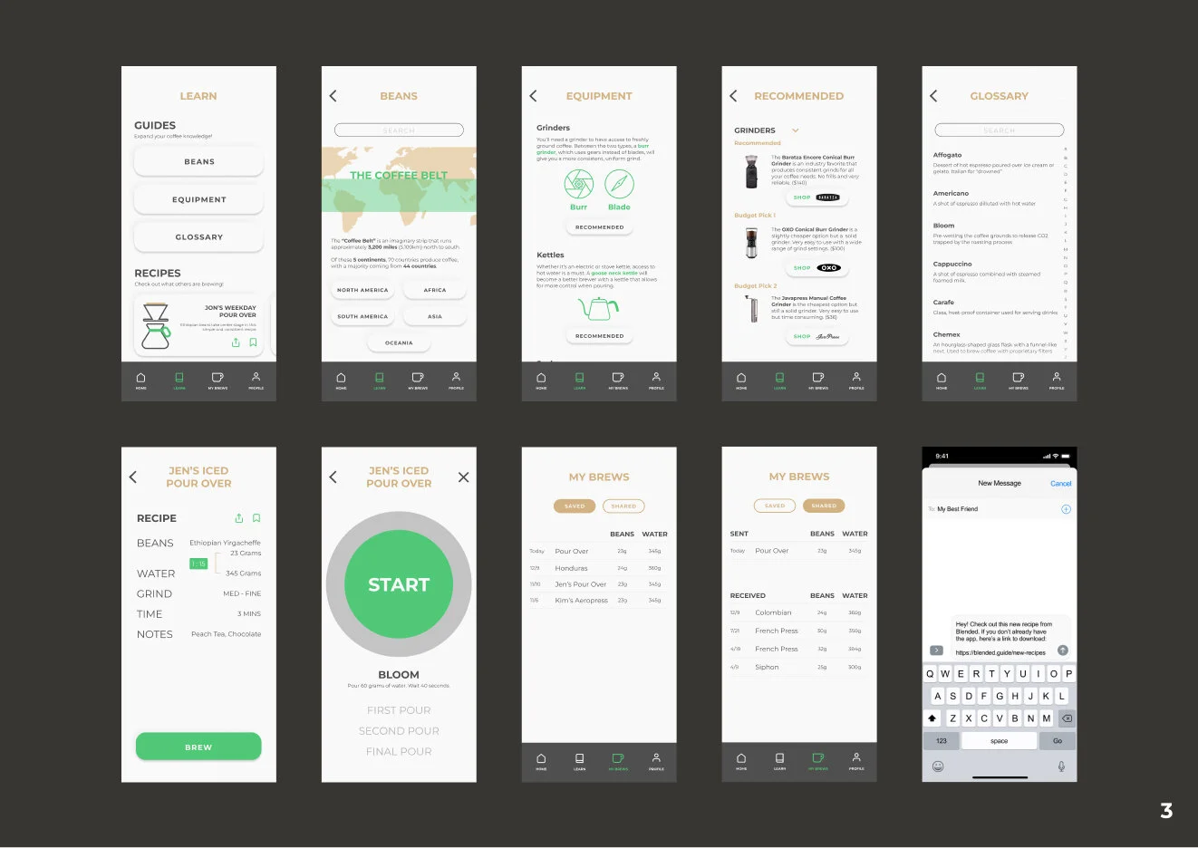
Final Prototype
After two rounds of testing with a total of 10 participants, I arrived at the current prototype. Usability testing allowed me to gain the perspective of potential users and adjust the designs accordingly.
Veering off the Happy Path - Brewing and Learning is at the core of the app, so I decided to highlight those two functions in a more streamlined home screen. Other features were either stripped away or simplified.
Separating the Brew Tutorial from Learning - Initially, users could choose to brew with step-by-step (BREW) instructions or choose to learn the method purely for knowledge (LEARN). However, the original design was trying to separate two inherently related paths. Users also thought that they were brewing when they were simply learning the recipe.


Reflections
The Blended app was set out to provide a better coffee brewing experience at home. At times, the designs did have features that were straying away from the main “happy path” and the MVP of the app. Multiple rounds of testing allowed me to adjust and design with the true objective in mind.
Lessons Learned
Always take a pulse and see if you’re staying true to the happy path.
Don’t morph your idea and compromise your objective just to fit in with what’s popular.